Tiana Liu

UX/UI internship · 2023–2024

Designing GrowMate’s onboarding and rebuilding its website.

GrowMate, now called Veggiecrush, is an app for growing food at home. As a UX/UI design intern I owned two pieces of work while a Senior Designer led the app: the pre-registration onboarding flow, which shipped in the live app, and the website redesign, whose structure the site still uses.

RoleUX/UI Design Intern
TeamSenior Designer + developers
TimelineNov 2023 – Apr 2024
I ownedOnboarding flow + website

A sign-up flow shaped by testing.

I started with competitor analysis and research into who the app was for, then worked the pre-registration flow through sketches, interaction logic and wireframes.

Tested remotely

Lightweight remote usability tests changed the number and order of steps, where the call to action sits and what comes first on each screen.

Usability and security

I weighed what the flow asks for, and when, against both ease of use and information security.

Shipped

Developers built the flow and released it in the live app.

The app was live. The website still behaved like a waiting room.

The single holding page did not explain the product, show the app or give a clear way to download it. I owned the information architecture and the UX/UI redesign: I mapped the Home, About and Contact journeys, set colour and type rules, and designed web and mobile together.
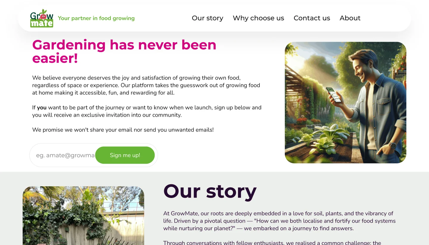
The original GrowMate holding page: a Gardening has never been easier headline, an email sign-up box, a stock photo and an Our story section
Before: the holding page the app was launched with.

Structure before screens

I mapped what each page needed to hold, then how a visitor would move from the homepage to download, the team story or partnerships.
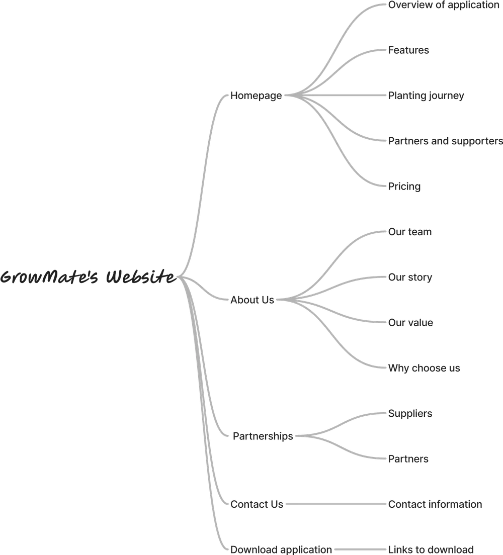
Site map for the GrowMate website: Homepage (overview, features, planting journey, partners, pricing), About Us (our team, our story, our value, why choose us), Partnerships (suppliers, partners), Contact Us and Download application
The site map: five top-level areas and what each holds.
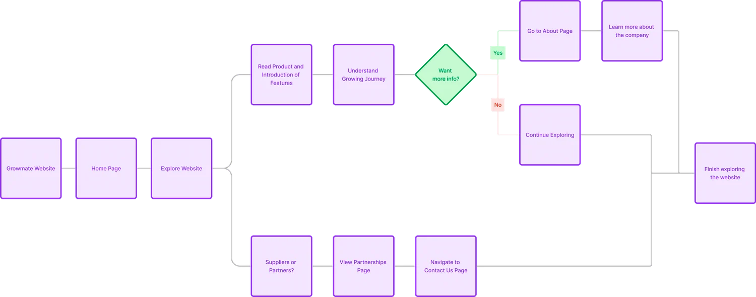
User flow from arriving on the website to the homepage, reading the product introduction and growing journey, then either learning about the company, continuing to explore, or going to partnerships and contact
The user flow: from landing to learning about the product, the company or partnerships.

Wireframes, web and mobile
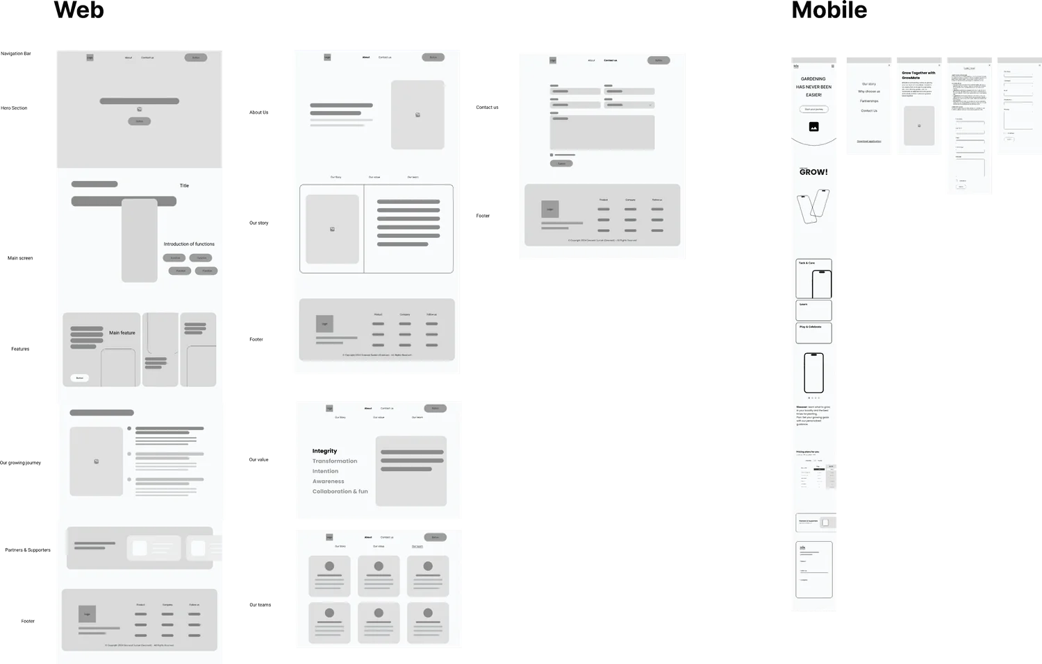
Low-fidelity wireframes for the GrowMate website on web and mobile, covering the homepage, about and contact pages
Low-fidelity wireframes, designed for web and mobile together.

Three iterations

V1 · Structure

Settled the hierarchy and what content goes where before any visual refinement.

V2 · Clarity

Improved the typography and made the download call to action easier to spot.

V3 · Story

Built a Discover → Grow → Harvest → Share journey around the mascot.
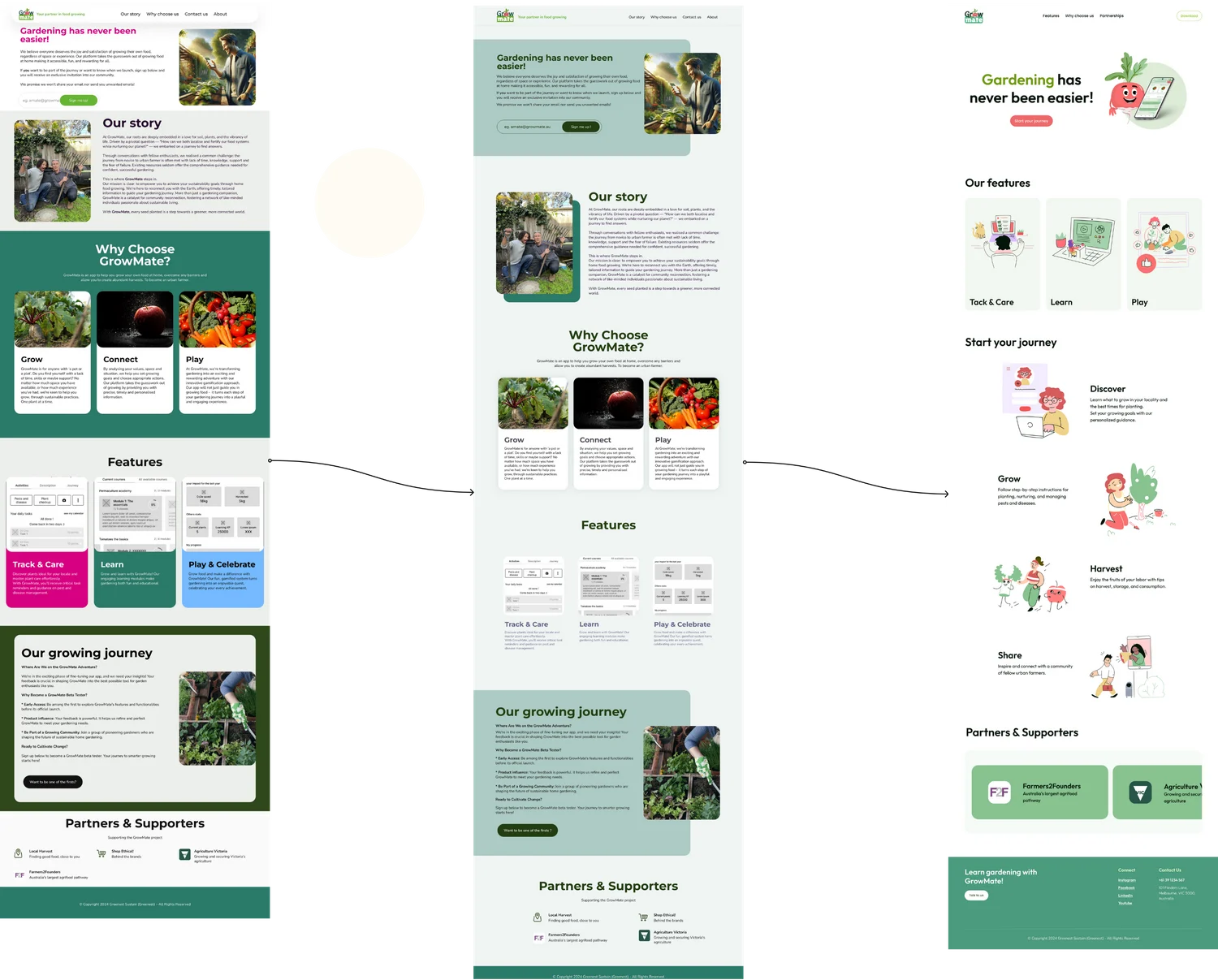
Three versions of the GrowMate homepage side by side: V1 with heavy photography and blocky sections, V2 with cleaner type and clearer calls to action, and V3 with illustrated characters and the Discover, Grow, Harvest, Share journey
V1, V2 and V3 of the homepage, left to right.

After

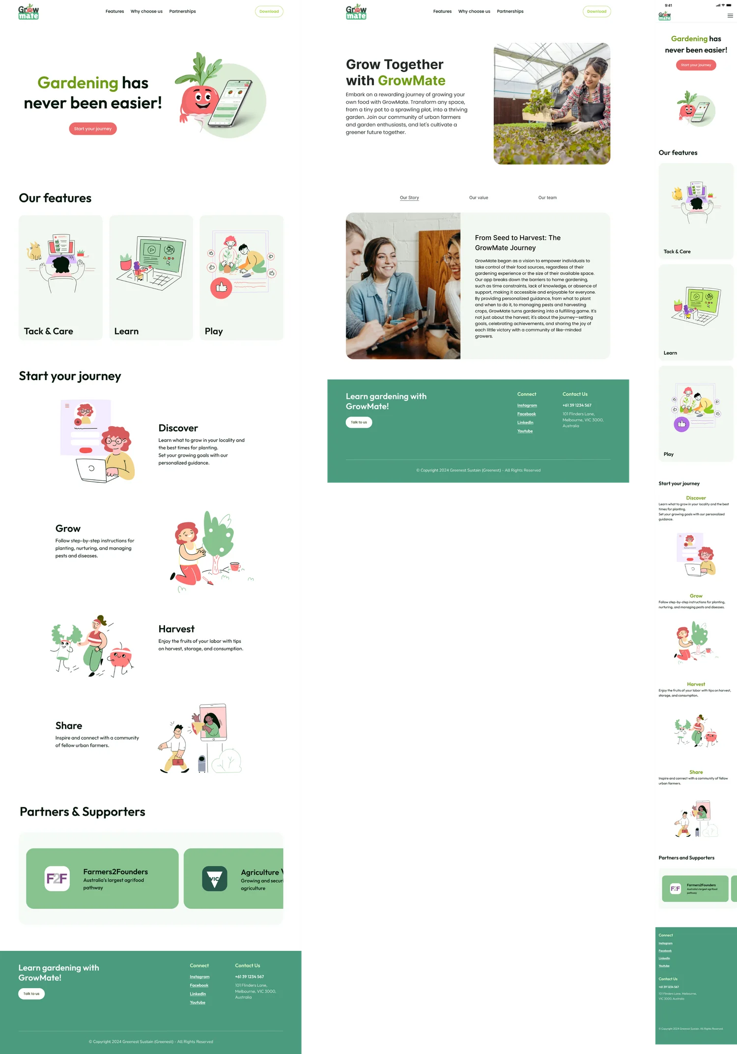
Final GrowMate website on desktop and mobile: a radish mascot hero, Our features (Track & Care, Learn, Play), a Discover, Grow, Harvest, Share journey, partners, and an Our story page
After: the final homepage and About page on desktop, and the homepage on mobile.

Both pieces shipped.

ShippedThe onboarding flow, released in the live app
Still liveThe website’s structure and visual direction, kept through later updates

A marketing website is part of the product, not a wrapper around it.

Skills shown: onboarding design · usability testing · information architecture · visual design