Product testing · onboarding · UX · 2026
Improving co-parenting onboarding through real-world product testing.
Kids First is a free app for separated parents, with messaging, a shared calendar, expenses and documents. It was already live when I joined in May 2026. While testing it, I found where parents get stuck connecting with their co-parent, then proposed a new onboarding flow with the rules and states a developer would need.
A messaging app for two people who may not want to talk.
Parents use Kids First to organise the children across two homes: topic-based message threads, a shared calendar, expenses and documents. The founder builds and ships the app. My part is testing it, reporting what breaks, and proposing changes.
Where AI fits
Shipped The app’s AI Conflict Filter, built by the founder, rewrites hostile wording before a message is sent, while keeping the times and decisions in it. I test how it behaves in real message scenarios. In onboarding it matters because the first message one parent sends is often the other parent’s first contact with the app.
Every claim on this page carries one of these labels:
- ShippedLive in the app or in use today.
- ObservedSomething I saw while testing the live app.
- ProposalMy designs. Not built, not shipped.
- HypothesisWhat I expect the proposal to change. Not tested yet.
The app only works once both parents are in it. Getting the second one in was the weak point.
Shared messages, events and expenses only mean something when both parents can see them. In testing, the hand-off between the parent who signs up first and the other guardian was where the journey went quiet.
Who’s involved
Signs up first and adds the children. Needs to know whether, when and how the other parent hears about it.
Gets an email from someone they may not be on good terms with. Needs a clear way in, and to trust that the children’s details are protected.
Builds and ships every change. A proposal that extends the live screens is easier to take on than a new flow.
I walked the app as both parents, step by step.
Observed I test messaging, topic tags, expenses and the calendar as real scenarios, using test accounts for both parents. Each finding goes into shared Lark files with annotated screenshots for the founder. I also use an AI tool that operates the phone to run through flows automatically, and I check what it flags myself.
No interviews or surveys with parents were part of this work. The findings below come from my own testing of the TestFlight build (2.7.3) and the live app.
The current sign-up path
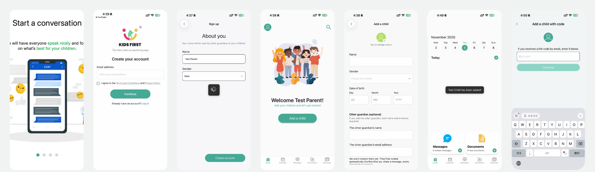
- Intro carouselShows features, but never mentions adding a child or a co-parent.
- Create your accountEmail and terms. Clear and short.
- About youGender is preselected as Male, and nothing hints at what comes next.
- WelcomeOne button: Add a child. Someone who was invited has no clear way in.
- Add a childChild and co-parent share one long form. The invite rule sits in small text at the bottom.
- Home after savingA toast, then an empty Home. No next step and no co-parent status.
- Add a child with codeThe invited parent’s entry, reached only from a small link under the long form.
First use of each feature
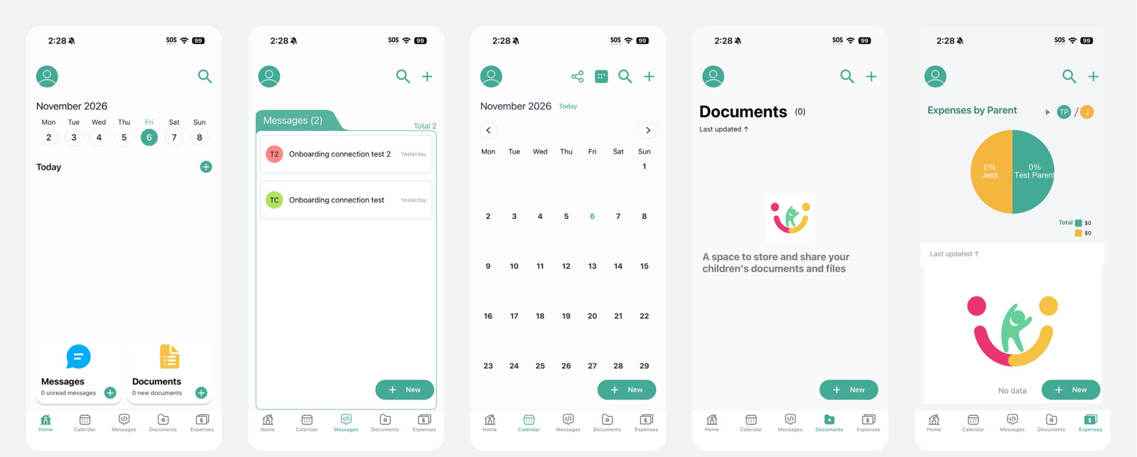
Six problems, grouped by who they hurt.
| Finding | Who it affects | Where |
|---|---|---|
| Observed The invitation rule (the other parent is emailed on the first share) is only stated in small print at the bottom of a long form. | Inviting parent | Add a child |
| Observed After saving, Home is empty: no next step and no sign of the other parent’s status. | Inviting parent | Home |
| Observed An invited parent has no obvious way in. Their entry, a link code, sits behind a small link under the Add a child form. | Invited parent | Welcome, Add a child |
| Observed The invitation email says the link code works instead of dates of birth, but after entering it the app returns to the date page. | Invited parent | Link code |
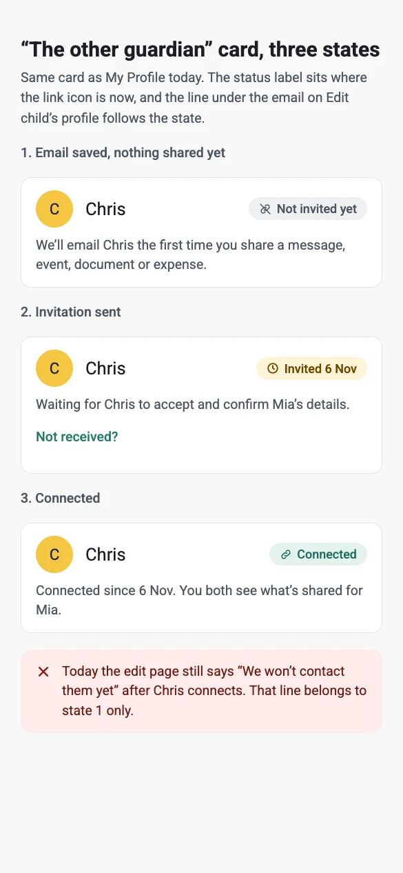
| Observed The edit page still says “We won’t contact them yet” after the other parent has connected. Linking two children sent two “co-parent has joined” emails at the same minute. | Both | Profile, emails |
| Observed Empty features don’t explain what to add first. Expenses shows a 50/50 pie at 0% and “No data”, which reads as broken rather than empty. | Both | First use |
Decide the rules first, then draw the screens.
Most of the work was deciding what happens behind the screens: when an email goes out, what each parent can see, and what a wrong date does. Each rule is marked by whether the founder has confirmed it.
| Rule | Behaviour | Status |
|---|---|---|
| Unit of linking | Per child. Each child links only when its date of birth matches. | Confirmed |
| Before linking | The invited parent can’t see anything shared until a child is linked. | Confirmed |
| After linking | Everything shared about that child becomes visible, including items shared earlier. | Confirmed |
| Read ticks | One tick means sent. Two ticks mean the other parent has read it. | Confirmed |
| Invitation trigger | The first share with the other guardian: a message, event, document or expense. | Live today |
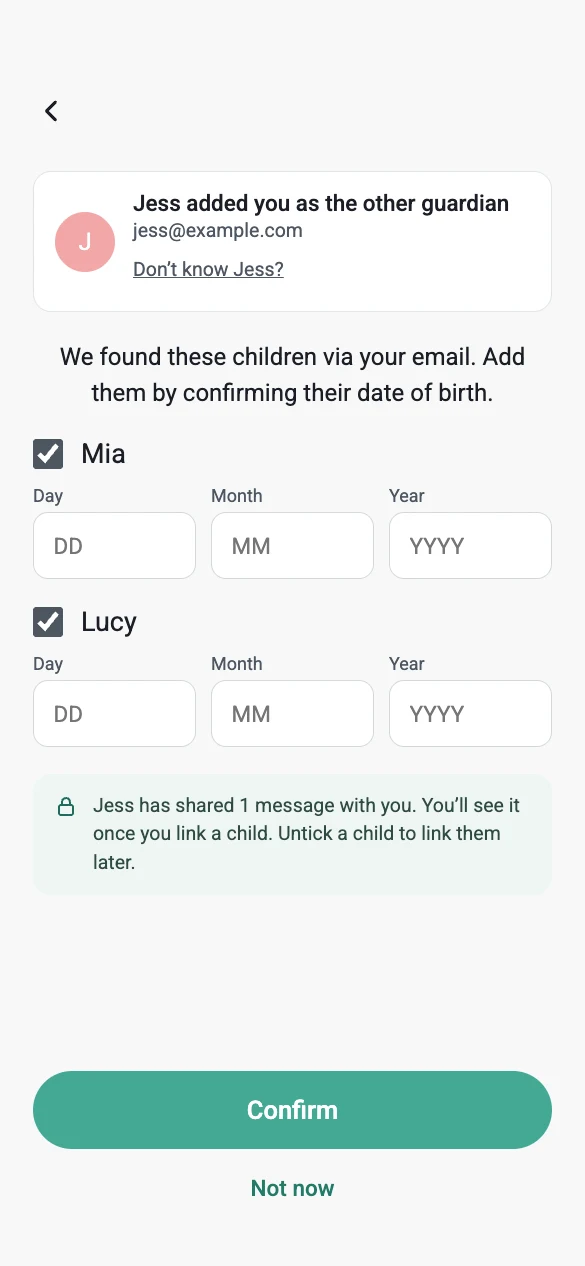
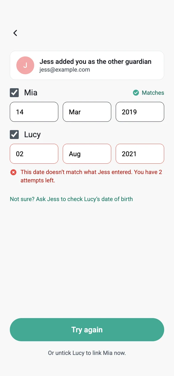
| Wrong date | 3 attempts per child, then that child pauses for 1 hour and shows when it unlocks. | Assumption |
| Resend | “Not received?” resends the same invitation, up to 3 times a day. | Assumption |
Trade-offs
That’s the live rule, and I kept it: the other parent arrives to a message, not an empty app. The cost: a parent who never shares never invites anyone. Whether to add “Invite now” is an open question for the founder.
A date of birth per child protects the children’s details from a mistyped email. It adds friction, so a wrong date blocks only that child and the others can link straight away.
Most proposal screens are the live screens plus one addition: an invite hint, an invitation entry, a status label. That keeps the build smaller.
Make the other parent part of setup, and let the first share do the inviting.
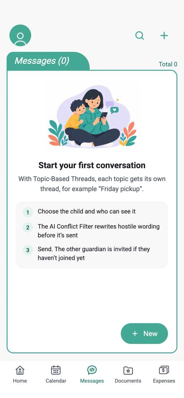
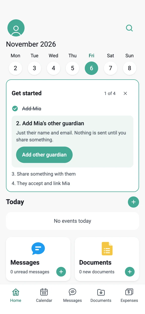
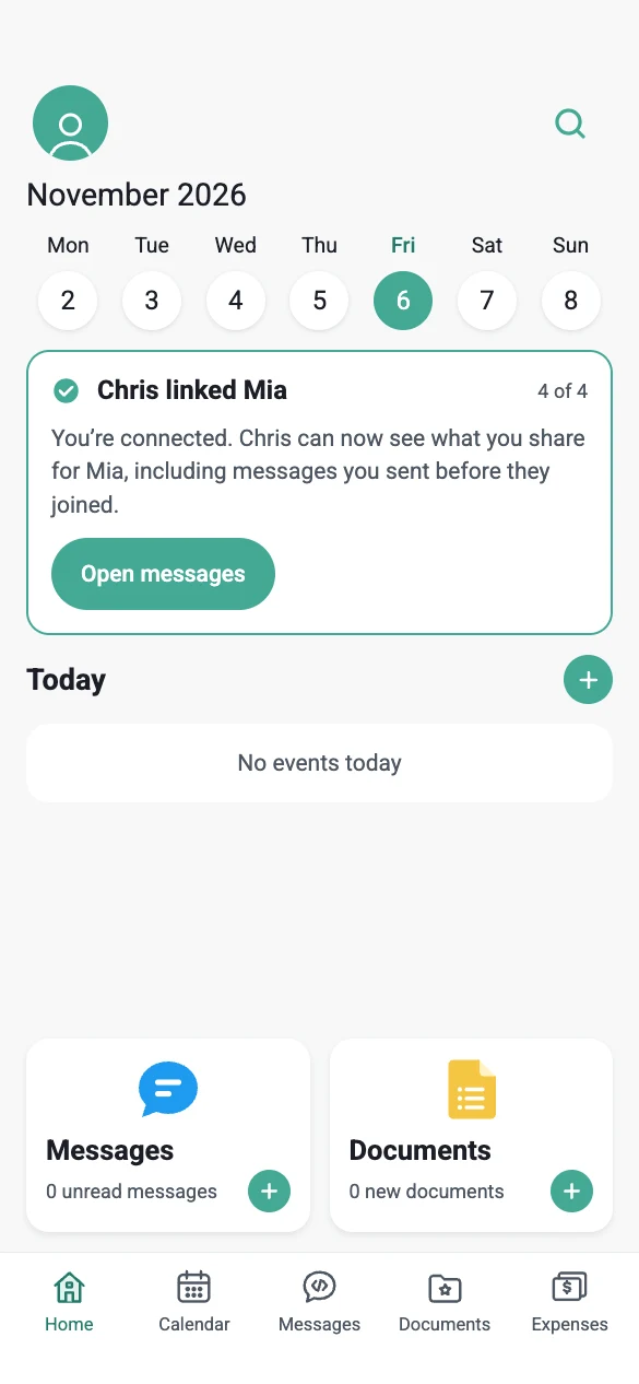
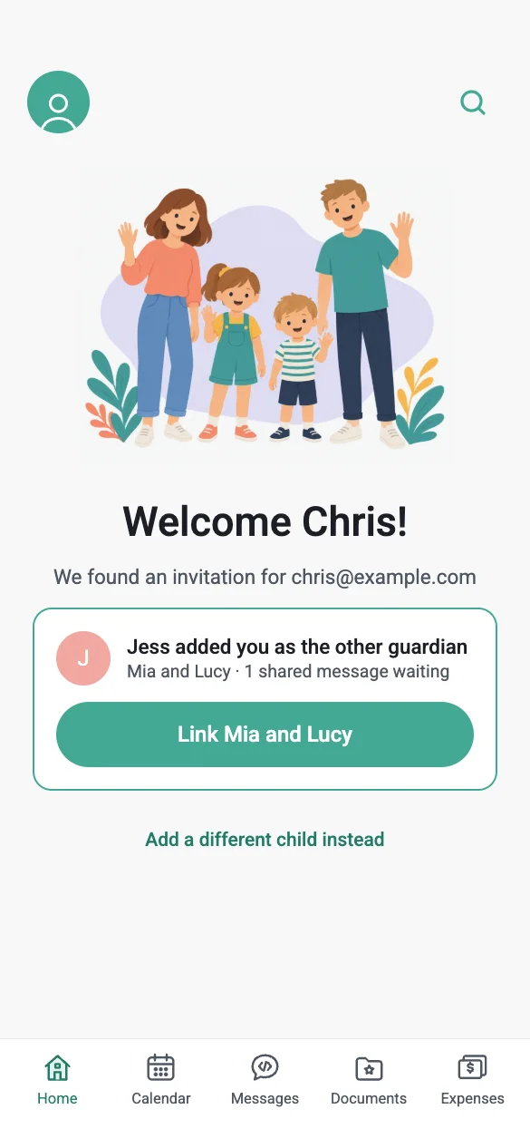
Proposal The journey runs: enter the app, add a child, add the other parent, then send the first message or event. That first share is the first meaningful action, and it also sends the invitation. The other parent confirms each child’s date of birth to connect.
- JessAdds Mia and Chris’s emailSaving sends nothing. Chris shows as “Not invited yet”.Nothing sent
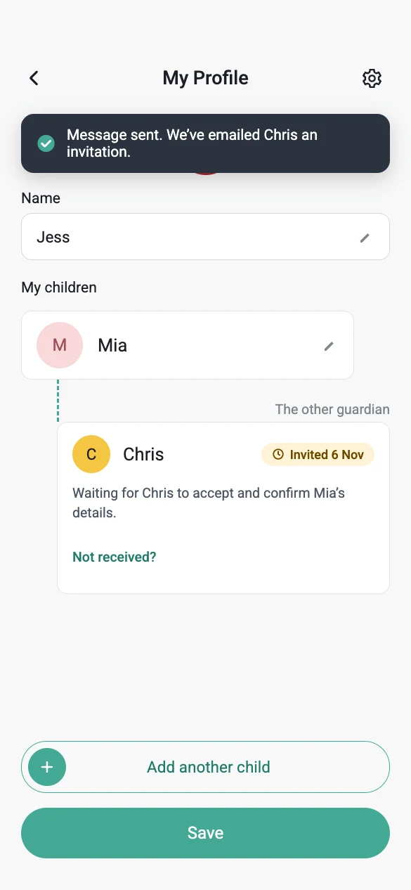
- JessShares something for the first timeA message, event, shared document or expense. This is the trigger.Invitation emailed
- ChrisOpens the email and signs upWith the same address. If he already has an account, he logs in.Invitation found
- ChrisConfirms Mia’s date of birthOr enters the code from the email. This is the security check.Child linked
- ChrisSees everything about MiaIncluding what Jess shared before he joined. Jess is told Chris linked Mia.Connected
What Chris can see about Mia: nothing in steps 1 to 3, even with the email and an account. Everything shared, old and new, from step 4.
The inviting parent: set up, then invite on the first share
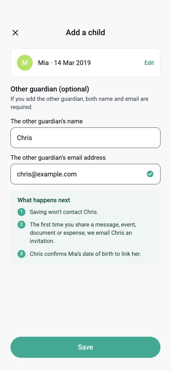
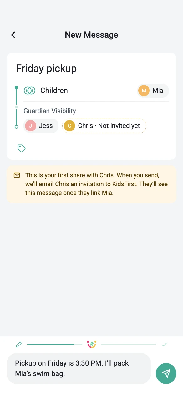
Invitation sent, pending and connected
The invited parent, with more than one child
Sent and read, explained once
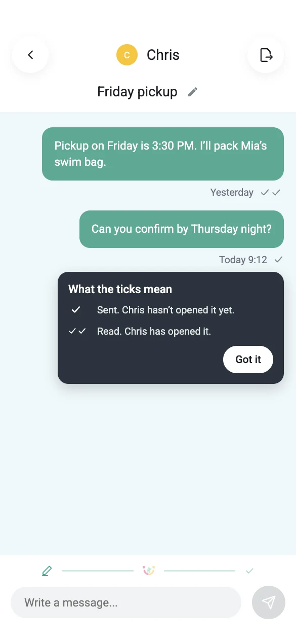
Illustrations in the proposal were generated with Figma AI to match the live app’s style. All names and emails are sample data.
How we’d know it works, before and after it ships.
Hypothesis If inviting is part of setup and the first share sends the invitation, more new accounts will end up with a connected co-parent. None of this has been tested yet.
Before building: a prototype walkthrough
- Pairs of participants, one playing each parent, using the proposal prototype.
- Inviting parent: add a child and the other guardian, then send a first message. Pass: they can say, unprompted, when the other parent will be contacted.
- Invited parent: start from the invitation email and link the children. Pass: they link without opening Add a child.
- Error path: one wrong date of birth. Pass: they link the other child and understand what to do next.
After release: success metrics
I specified analytics events for the developer handoff. Read in order, they form one funnel from sign-up to a connected co-parent.
onboarding_signed_upAccount createdchild_addedFirst child savedguardian_addedOther guardian saved (orguardian_skipped)first_share·invite_sentFirst meaningful action, which sends the invitationchild_linkedCo-parent connected
| Metric | Definition |
|---|---|
| Onboarding completion rate | Share of new accounts that reach first_share, meaning they added a child and shared something. |
| Invitation completion rate | Share of accounts with guardian_added that reach invite_sent. |
| Co-parent connection rate | Share of accounts with invite_sent that reach child_linked for at least one child. |
| Time to first meaningful action | Median time from onboarding_signed_up to first_share. |
| Verification friction (guardrail) | Rate of dob_failed and dob_paused per linking attempt, and invite_resent per invitation. |
These are proposed definitions. No data has been collected yet.
Open questions for the founder
- Can an invited parent dismiss a wrong invitation, and is the sender told?
- Should the link code link children without their dates of birth, as the email says?
- Can we offer “Invite now” without a first share, or must the invitation wait for it?
What I did, and where each piece stands.
| Work | My part | Status |
|---|---|---|
| Scenario testing | Testing messaging, tags, expenses and the calendar; annotated reports in Lark. | Ongoing |
| Typography and sizing fixes | Made in a test environment and pushed to GitHub. The founder decides what reaches production. | With the founder |
| Onboarding redesign | Flow, screens, rules, states, edge cases and analytics events. | Proposal |
| AI Conflict Filter | Testing how it behaves in message scenarios. The feature is the founder’s. | Live feature |
| Brand pack and social templates | An AI-readable brand context pack and reusable HTML/CSS templates. I check every image before it goes out. | In use |
Reflection
The screens took less time than deciding what happens behind them. Writing each rule down as confirmed or assumed made it clear which decisions were mine to propose and which were the founder’s to make. Testing the live app first gave the proposal its starting point: every screen in it answers something I’d already seen go wrong.
Find where the journey breaks, write down what must be true, and leave the founder a design that’s ready to build.
Skills shown: product testing · journey mapping · requirements and rules · onboarding design · measurement planning